top of page
Logo Design
Designing logos is one of the most crucial branding strategies, while understanding the business strategy and the marketing purpose is the first step. Having a design education background can help design professional and creative logos.

YIHEHUAYU brand color and logo design
Image 1: Color Palette & Visual Concept
Main Color – #357d73
A rich, elegant green conveying calmness, nature, and trust.
Used prominently in branding materials for a unified look.
Accent Color – #e8dfa9
A soft, pastel yellow-green that complements the primary color.
Adds warmth and harmony to the overall visual identity.
Visual Style
The background marble texture and floral arrangement create a high-end, delicate atmosphere.
The golden logo on the right evokes sophistication and luxury, aligning with the brand’s floral lifestyle concept.

YIHEHUAYU brand text design
Logo Design Standardization
The logo blends traditional Chinese calligraphy with a modern aesthetic.
The character composition is enclosed in a square seal-like form, symbolizing cultural heritage and precision.
Grid System
The logo layout is meticulously constructed with a 7A x 6A proportion to maintain consistency across applications.
The English name "YI HE HUA YU" is centered beneath the Chinese characters, balancing tradition and modernity.
Brand Message
“At this moment, I only smell the flowers, not talk about the past.”
This poetic tagline reflects the brand’s emotional core—focusing on presence, healing, and beauty through floral experiences.

YIHEHUAYU VI design
Uniform & Packaging Design
Apron: Dark green with a clean logo placement, giving a professional and elegant florist identity.
Box Tape & Kraft Bag: Uses floral motifs and branding elements to create a refined unboxing experience.
Floral Gift Card: Rich illustrations and color tones convey creativity, storytelling, and emotional connection.
Pink Business Card: Soft and approachable, suitable for expressing gratitude and femininity in flower gifting scenarios.
Tagline on materials:
“ENJOY A WINDOW OF FLOWERS, HOPE FOR A GOOD LIFE.”
This reinforces the brand philosophy—flowers as a symbol of hope, joy, and a beautiful lifestyle.

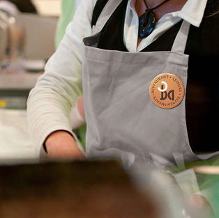
Ba Restauant logo

Ba Restauant logo 2

Ba Restauant logo 3

Ba Restauant logo 4

Ba Restauant logo 5

Ba Restauant logo 6
bottom of page
